t-SNE plots
A t-SNE (t-distributed Stochastic Neighbor Embedding) plot will show the combination of high-dimensional data (that is, with more than two output variables) in a computed two-dimensional map. t-SNE uses the original distances in the high-dimensional space to calculate the t-SNE coordinates. In simple terms, similar data points in the high-dimensional space tend to group in the t-SNE coordinates as the weight of the distances is preserved, but not the actual distance. When working with t-SNE plots, use Color by as the first step, then interact manually with the data points, and finally tune the hyperparameters.
After selecting the variables to visulize with a t-SNE plot, there are three different hyperparameters that can be adjusted. The perplexity, learning rate and number of iterations.
The perplexity can be interpreted as a smooth measure of the effective number of neighbors, where the larger the perplexity, the more non-local information will be retained in the dimensionality reduction result.
The learning rate is a factor contributing the gradient update, which includes an exponentially decaying sum of previous gradients as a way of avoiding poor local minima. A very large learning rate will demand more iterations to ensure convergence.
The number of iterations denotes how many iterations will be done. If the number of iterations is set very high and the plot has reached convergence, plotting can be stopped early by pressing Stop.
When running t-SNE plotting, the plot will be adjusted live through the iterations in the plot window.
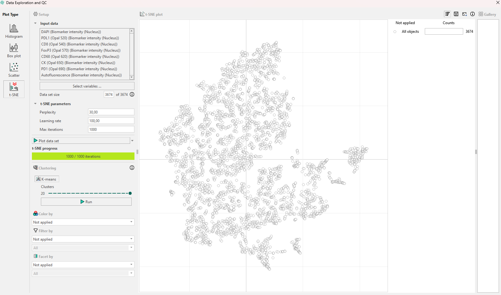
After running the first t-SNE plot with default parameters, inspect the results:
- Look for any shapes that are forming subpopulations.
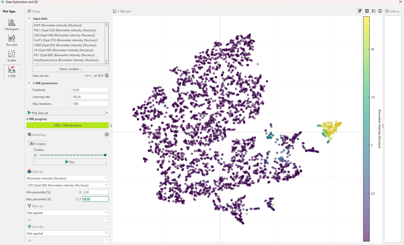
- Use Color by with continuous or categorical variables and see if any subpopulation appears. Remember that the Min and Max percentile can be edited. If biomarker intensity is used to color the points, a secondary dropdown menu will allow for selection of the speficic biomarkers to threshold by, as seen below.
- Use Filter by with categorical variables investigate a certain sub-selection(s) of the full data set and look if any variable can explain the plot.
- Use the interaction with the points to move the image viewer to that point.
If the first inspection does not reveal any relevant information, remember that the hyperparameters will affect the plot. Try to re-run the algorithm while adjusting the hyperparameters systematically in the following order:
- Perplexity: If no clear subpopulations have formed, try to adjust the perplexity. This parameter controls how the algorithm balances attention to the local and global aspects of the original high-dimensional data.
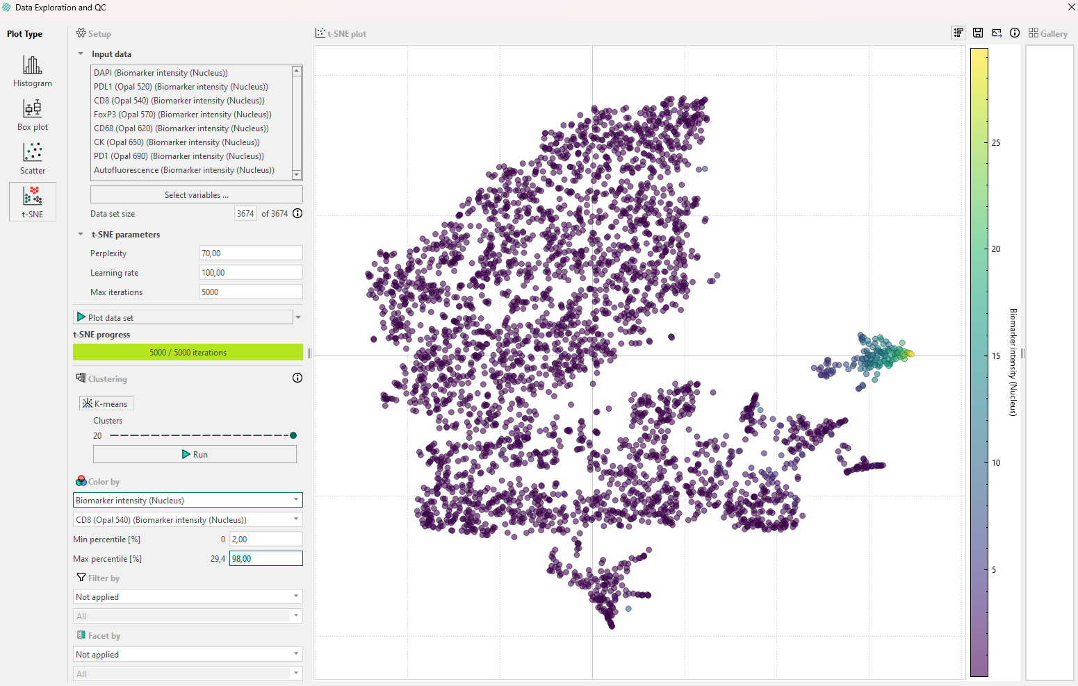
- Iterations: Different data sets can require different numbers of iterations to converge. Increase the number of iterations if the t-SNE plot looks “stretched” or “folded” onto itself. Increase until cluster stability is reached, e.g., 1000 to 5000 where defined clusters are separated by equal spaces.
- Learning rate: This parameter should be adjusted last, and it controls how large steps/adjustments the algorithm is allowed to make at each iteration.
Outliers in t-SNE plots are points that do not belong to the group where t-SNE placed them. To spot outliers, start by coloring the data one by one with the same output variables used as input to the t-SNE algorithm. The goal is to find a variable that will give clustered points the same color. Outliers can occur as points with a distinct color inside an otherwise homogeneously colored collection of data points but remember to manually verify this by interacting with the data point and looking at the data in the image viewer.
k-means clustering can be used to identify and group similar data points in a lower-dimensional space. This is done by asssigning each point to a cluster, to which it is most similar to. Increasing the number of clusters, k, will allow for identification of less obvious patterns in the data, but might also lead to non-descriptive clusters. Values for k can be between 2 and 20.
When using t-SNE remember the following:
- t-SNE subpopulation sizes carry no meaning.
- t-SNE distances are not representative of the original data differences.
- Random noise in the original data is not always random in t-SNE coordinates.
- Shapes only sometimes appear, so use color by to find structures.
- Run several experiments varying (at least) the perplexity.
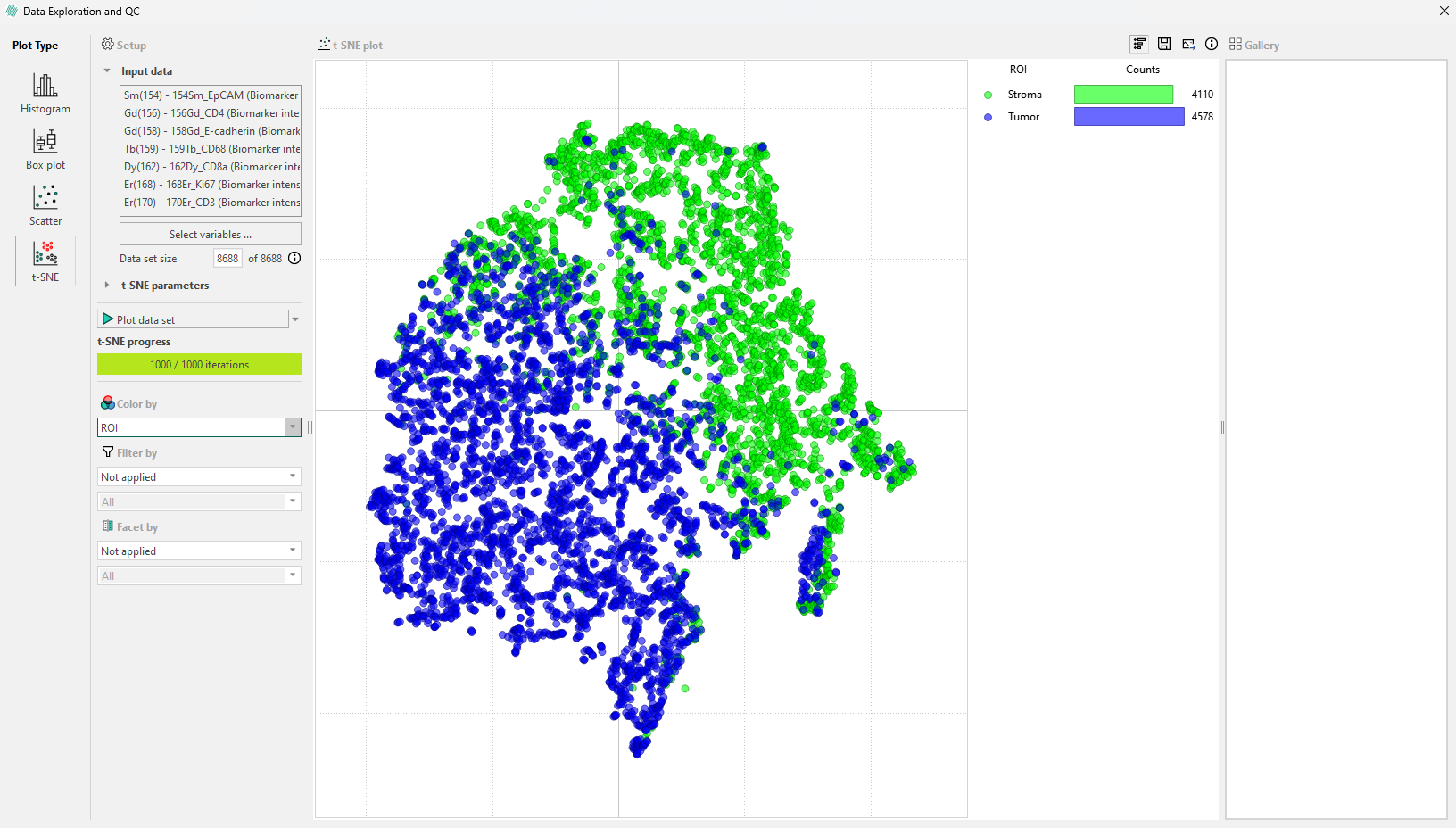
Legend bar for t-sne plots
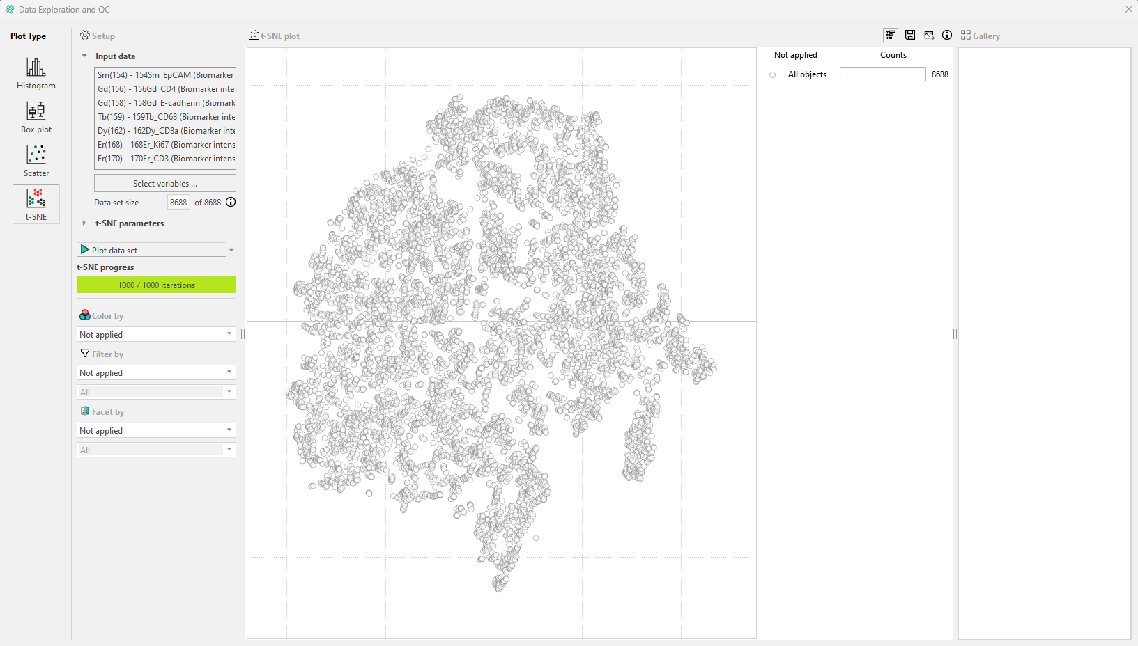
In versions 2024.07 and newer, an interactive legend appears in the top right corner of the t-SNE plot. Initially, the legend displays the total number of cells in the plot. For example, the following plot contains 3674 cells.
Cells can be colored based on the Region of Interest (ROI) they originate from. When this is done, the legend updates to show the number of cells in each ROI within the sample image.
Cells by category in the legend bar: Click on a ROI category in the legend, such as ‘Normal epithelium’ to select all cells in that category. This will highlight these cells in the image and display a gallery in the sidebar where they can be viewed.
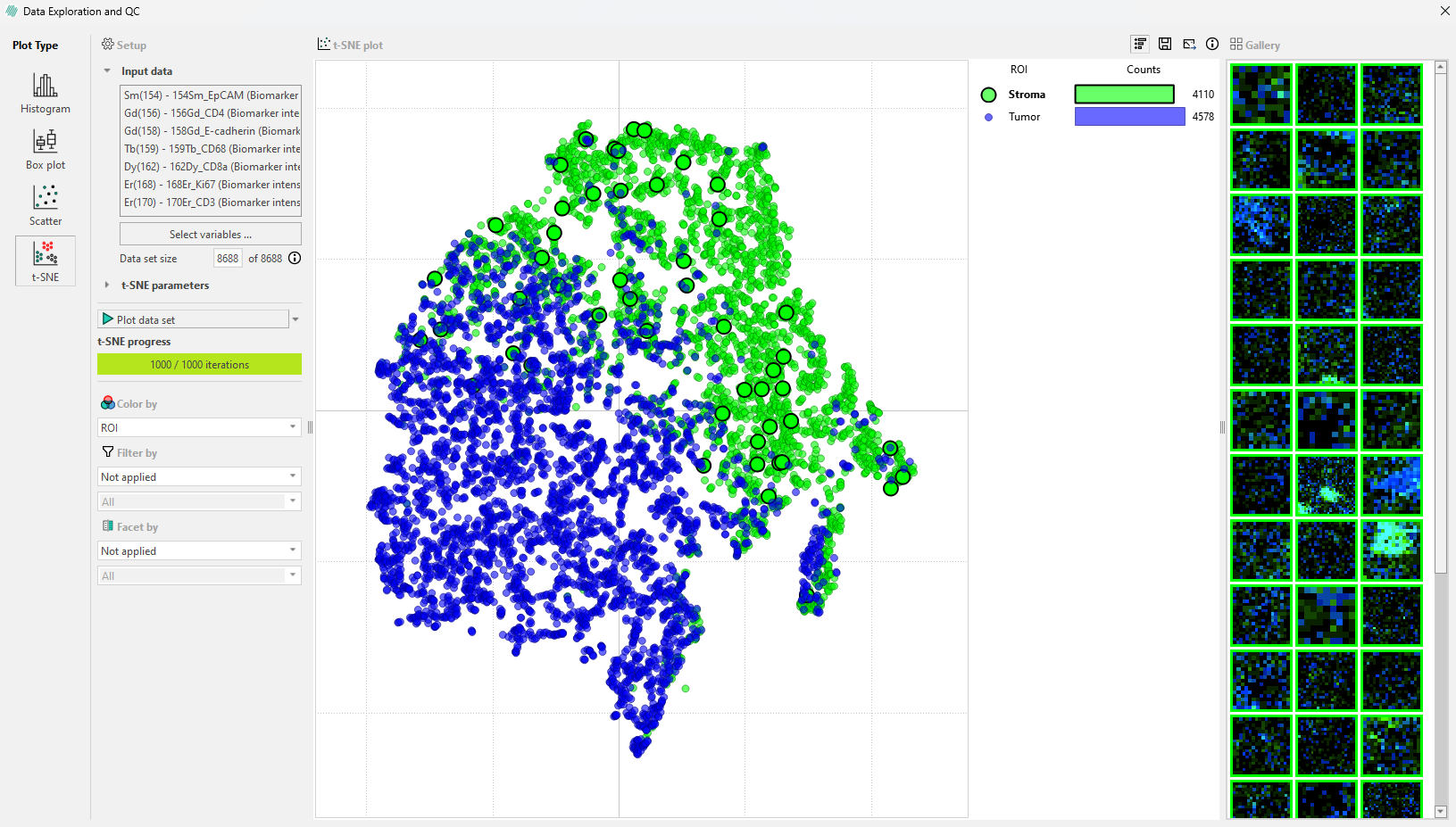
Only a subset of these objects will appear in the gallery, but all objects within the ROI will be highlighted.
The “Facet by” option can be used to divide the plot in the legend bar into subplots. In the example, the plot is faceted by Label. The legend will then show the different regions colored by ‘ROI’ (in this example) and the number of cells within each region for each label.
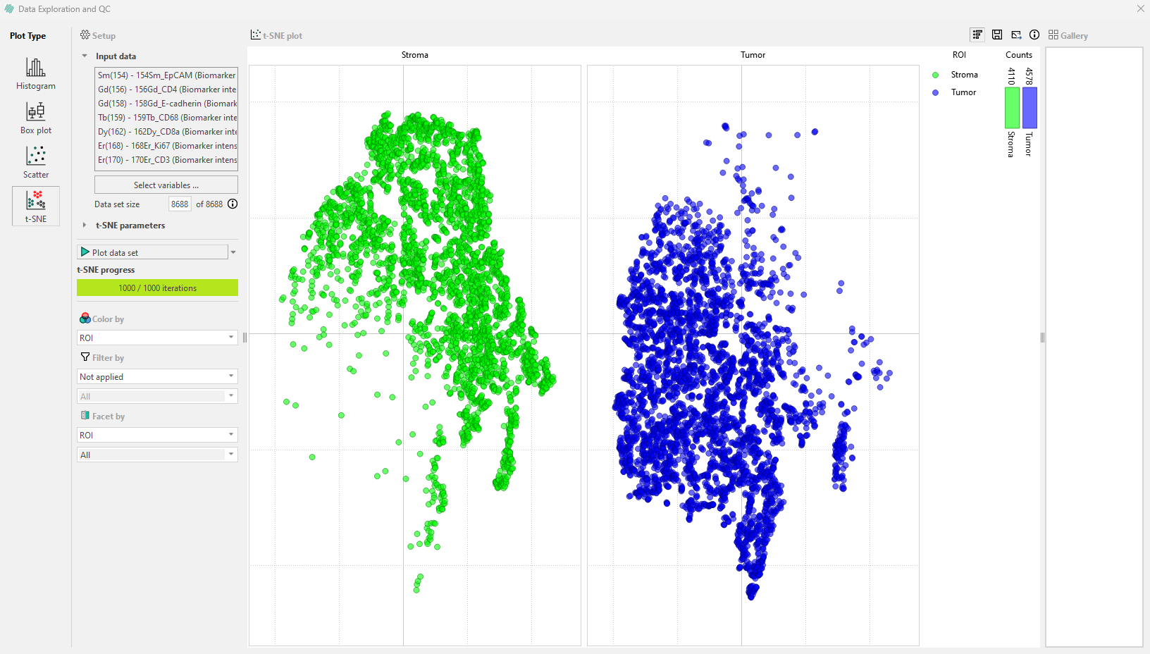
Hovering over a category in the subplot with the mouse will display the number of cells in a specific ROI and the percentage of total cells they represent within each label.
For more information please refer to: the original paper on t-SNE or How to Use t-SNE Effectively.