Scatter plot
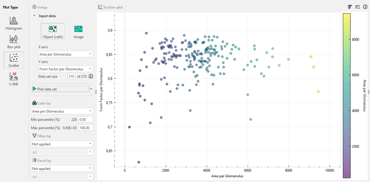
A scatter plot is best suited when you want to visualize the possible relationship or correlation between two continuous variables, making it useful for identifying patterns, trends, and outliers in bivariate data. Like the other types of plots it can be downsampled, colored, filtered or faceted.
In the image below, the relationship between the area and perimiter of the detected cells has been plotted, and has been colored by the intensity of the cells. The outliers that indicate elongated cells generally have lower intensities than the more rounded cells. This could be caused by cells with less intensity more often being erroneously outlined, knowledge which can be used to make the detection APP more accurate.